

News &
Insights.

Thoughts, tips and insights on UI/UX design,
web design and digital products.

Principles of Layout Design
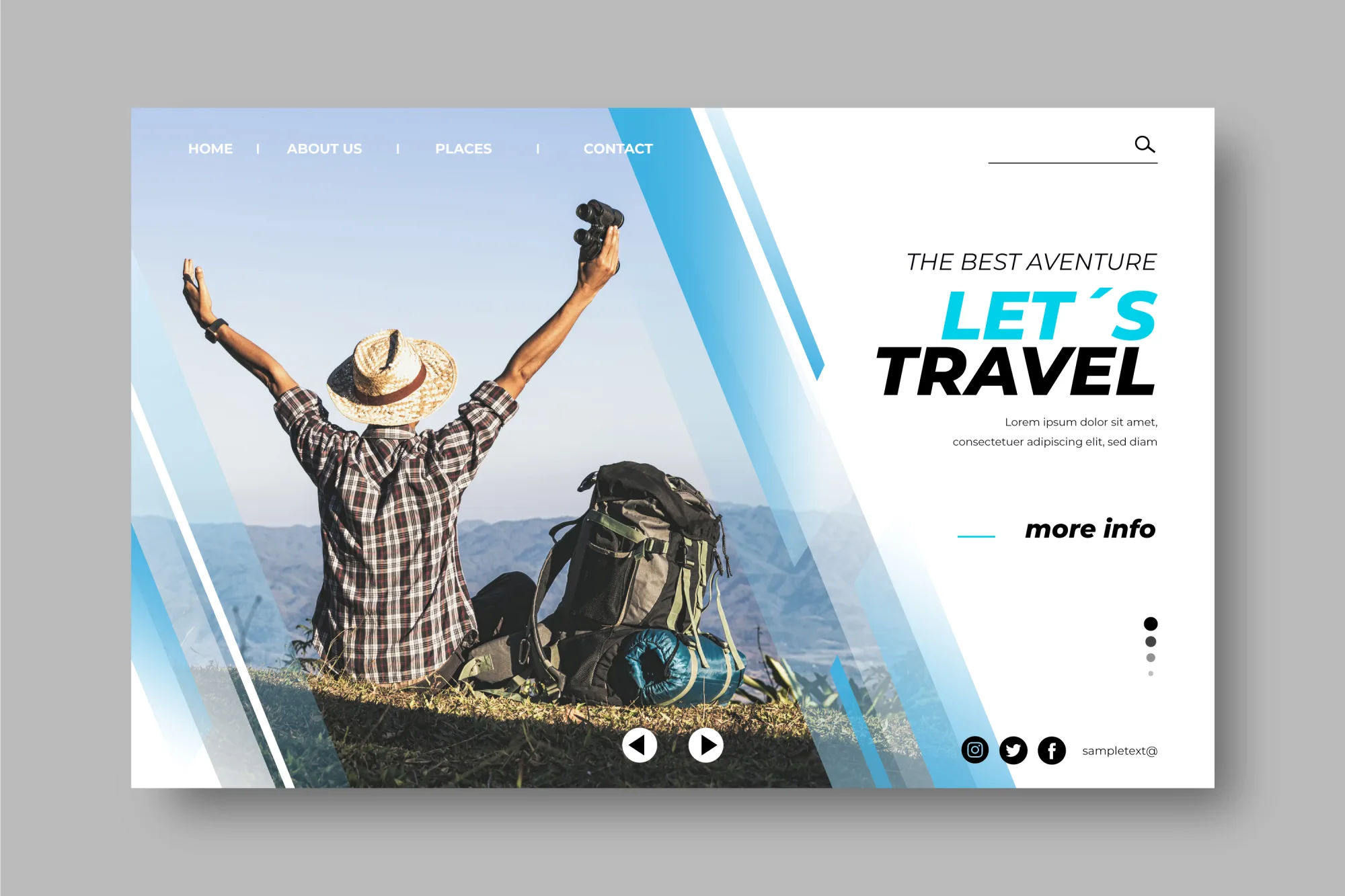
One of the most important tasks of graphic and UI/UX designers is to communicate information clearly, understandably and attractively. Content has to be arranged so that users immediately see what matters and can move effortlessly through a website, app or any other digital application.
This is exactly where layout design comes in. By deliberately arranging text, images, shapes, colours and white space, you create a clear visual structure that not only looks good but also improves usability.
A well-thought-out layout is therefore a fundamental requirement for good design. If you understand the key principles and apply them correctly, you can present content more effectively while creating a harmonious, professional look.
In this article you will learn why a good layout matters so much, which basic principles play a role and what to pay attention to when designing.
Part 1: Why is layout design so important?
A good layout is the foundation of successful design. It helps to structure creative ideas and ensures that individual elements are combined deliberately rather than at random.
At the same time, the layout has a decisive influence on how a brand, a message or a product is perceived by the target audience. That is why every designer should be familiar with the basic benefits of a well-planned layout.
Among other things, a well-thought-out layout provides:
- A clear reading flow: content is arranged logically, making it easier to take in and understand.
- An appealing design: a harmonious appearance sparks users' interest and motivates them to engage more deeply with the content.
- A harmonious overall picture: text, images, colours, shapes and white space are carefully matched to one another.
- A better user experience: information is presented clearly, so users find what they are looking for faster and can interact with a website or app more easily.
Part 2: The 6 most important principles of layout design
When designing a layout, it is not enough to simply spread different elements across a surface. Professional design is based on certain fundamental principles.
These principles help to structure content, create visual relationships and achieve a balanced design.
Let's take a closer look at the six most important principles.
1. Elements
Before you create a layout, you should know which basic components a design consists of.
The most important layout elements include:
- Text: headlines, subheadings, body copy, captions and all other typographic content.
- Images: photos, illustrations, infographics and other visuals can complement information and make content easier to understand.
- Lines: horizontal, vertical or diagonal lines can separate areas, emphasise structures or deliberately guide the user's eye. Length, weight and colour can vary.
- Shapes: geometric, organic or abstract shapes can highlight certain areas and support the visual message of a design.
- White space: white space refers to areas deliberately left empty between individual design elements. It creates clarity and calm and can put important content in the spotlight.
Once you know the basic elements of a layout, the next step is to combine them purposefully.
2. Visual hierarchy
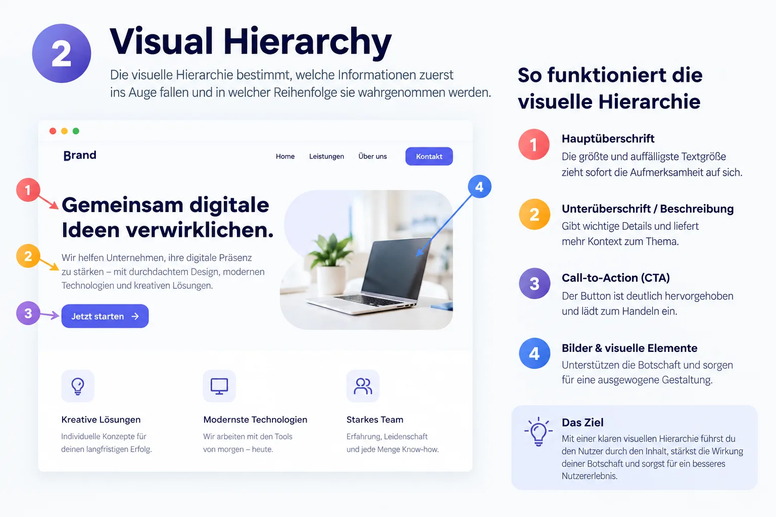
Convincing design needs a clear visual hierarchy. It determines which content users notice first and which information follows.
Using different sizes, font weights, colours, spacing or positions, you can emphasise certain elements and steer attention deliberately.
A well-structured hierarchy ensures that users do not perceive content as an unordered mass of information but are guided through the design step by step.
3. Alignment
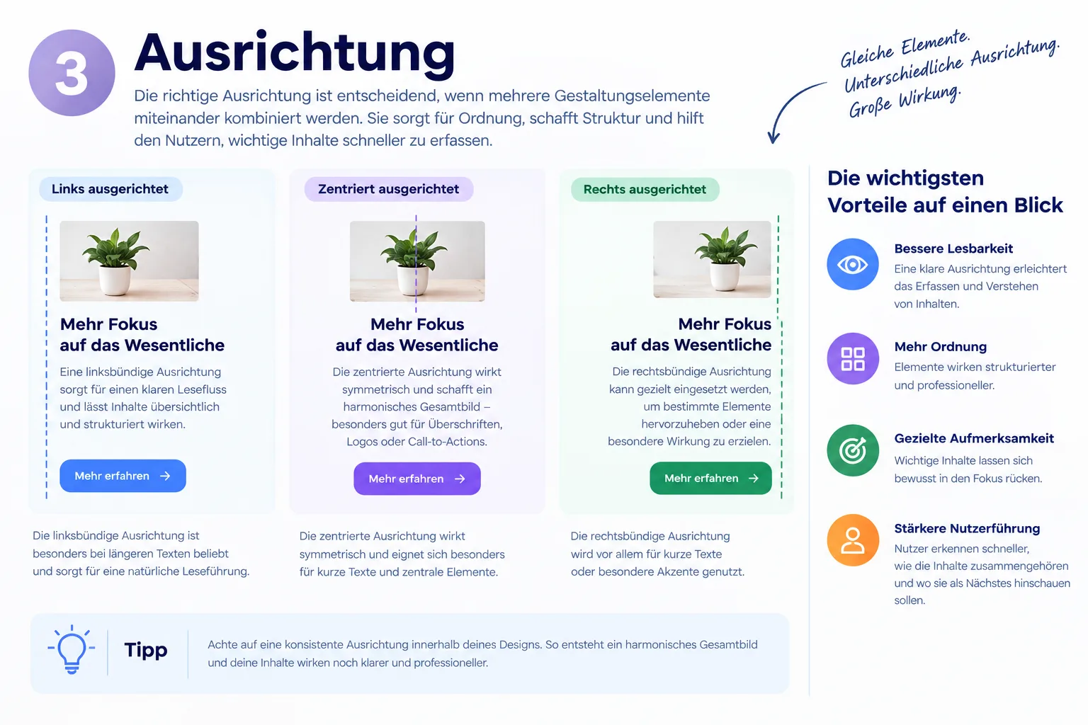
Correct alignment plays a decisive role when several design elements are combined.
Text, images, buttons and other elements should be aligned deliberately with one another. Depending on the design, left-aligned, right-aligned or centred alignment can be used, for example.
Consistent alignment creates order and makes it easier for users to recognise relationships between different pieces of content.
4. Contrast
Contrast helps to make certain elements stand out and to draw the user's attention to important areas.
You can work with different colours, font sizes, font weights or shapes. The contrast between foreground and background also plays an important role.
Used correctly, contrast ensures that individual elements are clearly distinguishable and that the design as a whole is more expressive.
5. Balance
Balance describes the visual equilibrium within a layout. The various elements should be distributed so that the design looks neither cluttered nor unbalanced.
A distinction can be made between symmetrical and asymmetrical balance.
In a symmetrical composition, elements are arranged relatively evenly on both sides. An asymmetrical design, on the other hand, deliberately works with different sizes, positions or weights.
Which variant is more suitable depends on the desired effect and the message of the respective design.
6. Proximity
The principle of proximity describes the spatial relationship between different elements.
Elements that belong together in terms of content should also be placed visually closer together. This helps users recognise more quickly which pieces of information belong together.
Conversely, larger gaps can be used to separate different content areas from each other.
Using spacing deliberately therefore improves not only the look of a layout but also its clarity and usability.
